
New Brand Identity Helps Usher in New Era for Utica University
"The new brand identity is a natural evolution in how the Utica brand is visually expressed visually to aid in telling the remarkable story of the institution.”
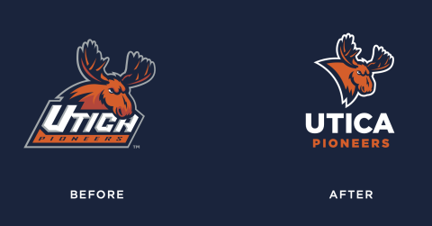
Utica University has unveiled a new visual brand identity featuring a redesign of the university’s primary institutional and athletic marks as well as the creation of new secondary athletic marks and word marks. The new identity celebrates and advances Utica’s recent achievement of university status.
“The recognition of the New York State Board of Regents that Utica has achieved university status is a natural next step in the maturation of our institution,” says Kelly Adams, vice president for presidential affairs and chief marketing and communications officer. “Similarly, the new brand identity is a natural evolution in how the Utica brand is visually expressed visually to aid in telling the remarkable story of the institution.”
The new identity and supporting logo system were designed by Joe Bosack & Co., a national branding and design firm.

“We are thrilled to be working with Utica to evolve its brand identity, especially at such a monumental time in the institution’s history,” says Joe Bosack, founder and creative director at Bosack & Co. “The recent visual identity modifications reflect the aspirations of the university and its dynamic learning community.”
The new institutional identity system maintains the previous color palette and typography as well as the familiar horizon line graphic element, which was adjusted to better frame the word university. Alternate variations of the institutional that were part of the previous identity system have been retired in favor of a singular, consistent logo.

Similarly, the new athletic identity features simplified and streamlined logo system. A slightly modified moose logo is maintained as a primary logo, and in an effort to more closely align the athletic identity to the institutional identity, the Gotham font used in the institutional logo is implemented as an athletic word mark, from which a bold, standalone U secondary logo is extrapolated.
“Standalone letter form logos are consistent with intercollegiate athletics all over the place – take for example the iconic, block M of the University of Michigan,” Bosack says. “The athletic word mark and secondary logo are simple and clean, which will translate really well not only to uniforms but to other applications where an athletic identity really needs to function – small embroidery and digitally across social media, for instance.”
“This update to the visual brand identity is, by design, evolutionary not revolutionary,” Adams explains. “What it achieves is a much cleaner, easier-to-use system of marks that allows greater ease in presenting and maintaining a consistent image of Utica University.”
More Stories

When a squeak is not just a squeak – Marshall Hildreth ’26
When one hears the squeak of a mouse in their basement, they most likely may be wondering how it got...

Pursuing the Art of Law
Two short years ago, Bernadette King ’28 wasn’t convinced that she would even attend college. Now she’s contemplating law school....
Office Spotlight: Student Involvement and Leadership
Dedicated employees across the University are advancing the mission and future of Utica through their wide-ranging contributions, talents, and passion....
I would like to see logins and resources for:
For a general list of frequently used logins, you can also visit our logins page.